Bringing It All Home With Armageddon Time’s Design
Interview with production designer Happy Massee
In Armageddon Time, writer/director James Gray reaches back into his own life to recreate a moment from recent history. Set in Queens, New York, at the start of the 1980s, Armageddon Time tells the story of Paul Graff (Banks Repeta), an eleven-year-old who is just starting to grasp the hard realities of the world he lives in. The security that his parents (Anne Hathaway and Jeremy Strong) and his sage grandfather (Anthony Hopkins) provide him contrast sharply with the fragile support system provided to his African American best friend, Johnny (Jaylin Webb). At first glance, the world of Armageddon Time, with its clunky computers and miniature TVs, seems part of the distant past. Only at closer viewing do its social and political realities appear dangerously close to home. As The Los Angeles Times notes, “The distance and specificity of the movie’s 1980 setting serve as a reminder, troubling as well as reassuring.”
To get the veneer of 1980s Queens just right, Gray turned to his collaborator, production designer Happy Massee. In addition to production designing two of Gray’s earlier films, The Immigrant and Two Lovers, Massee has lent his talent to creating cutting-edge environments for music videos and high-end fashion campaigns. In Armageddon Time, Massee worked closely with Gray to recreate, piece-by-piece, the artifacts of the past. “We copied as much as we could, notes Gray. “The cheesy hi-fi system, the green carpet, the sofa with the green and turquoise blue pattern… the weird mix of Danish modern with the Ethan Allen furniture.”
We spoke with Massee about working with Gray to get the period pitch perfect, finding the exact artifacts of the time, and recognizing how this story speaks to the world we live in now.
Get tickets to Armageddon Time now.
The official trailer for Armageddon Time
Production designer Happy Massee
When Gray approached you about working on Armageddon Time, how did he imagine the production design?
Since it was an autobiographical picture, his pitch was very personal. It was a lot more personal than the other movies that I have done with him where I had a little bit more freedom in coming up with the environments. With The Immigrant I came up with the look for the nightclub and the tenement in the film was based on a friend's apartment. Here, much of the film was set up by the 200 slides that James provided me to show me what his family was like back then.
For Gray, the period and place of the film are very personal. Do you have a connection with the film’s locales?
In a way. I grew up in France with American parents, so I visited New York a lot in the early 60s. I moved here as a young adult in 1979, when the film takes place. So as a scrappy young boy running about the streets, I knew what New York looked like back then. But I didn't really know the neighborhood of Queens that well. So, I knew the aesthetic, but not the details. We spent a lot of time scouting the neighborhood and looking at row houses in Queens before we started.
How did you transform the slides that James gave you into your production design?
Once James showed me all these pictures of and references to his childhood house, I adapted them to my aesthetic. I had the freedom to go out and find things like wallpaper that would have been appropriate for it. I just went with my taste and my design. In working with him on Two Lovers, I realized that we saw eye-to-eye on many things. While Two Lovers doesn’t take place in the same period as Armageddon Time, the design was very similar. In creating the Graffs' home, we found a house that we completely refigured to make it look like Queens. We moved fireplaces and ripped out windows. I connected to my own experiences and memories of my uncle's house in New York City. For research, we tapped into my crew’s memories since we grew up in the same generation.
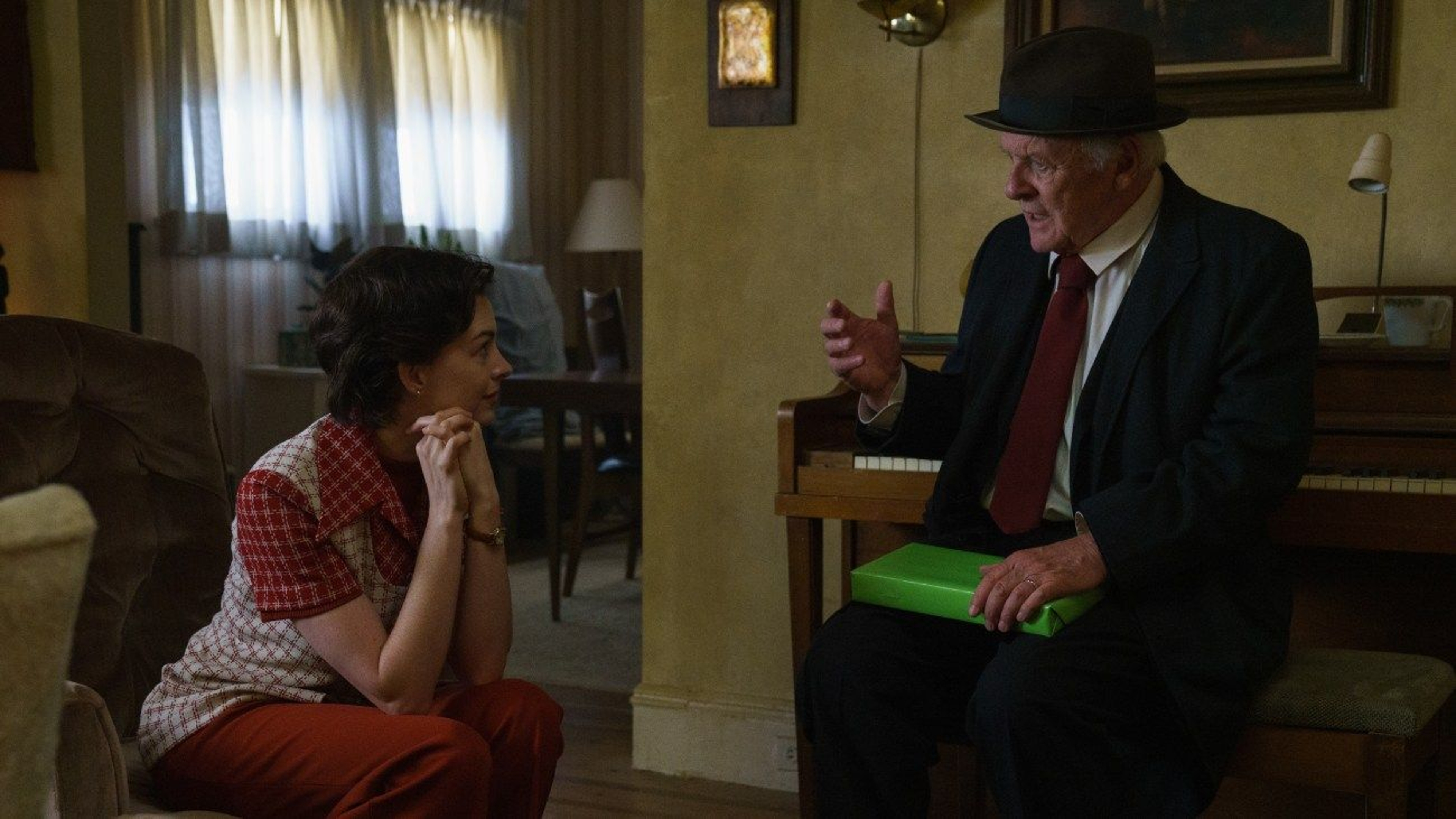
Anne Hathaway and Anthony Hopkins in Armageddon Time
The film’s director of photography, Darius Khondji, relates how Gray talked to him about emulating a Proustian sensibility in the film's look. Did you also seek to evoke that sense of memory with your design?
Initially when we started, we referenced a lot of things, like Saul Leiter’s photography, that you reference in making a personal New York story. But we only had four weeks to prep once the film got green-lit, so we were moving very quickly. I sat in on the meetings with James and Darius, but I think they took it one step further in discussing the emotions of the characters being reflected in the film’s look. I treated the house like a character in the movie.
Can you talk about the film’s color palette?
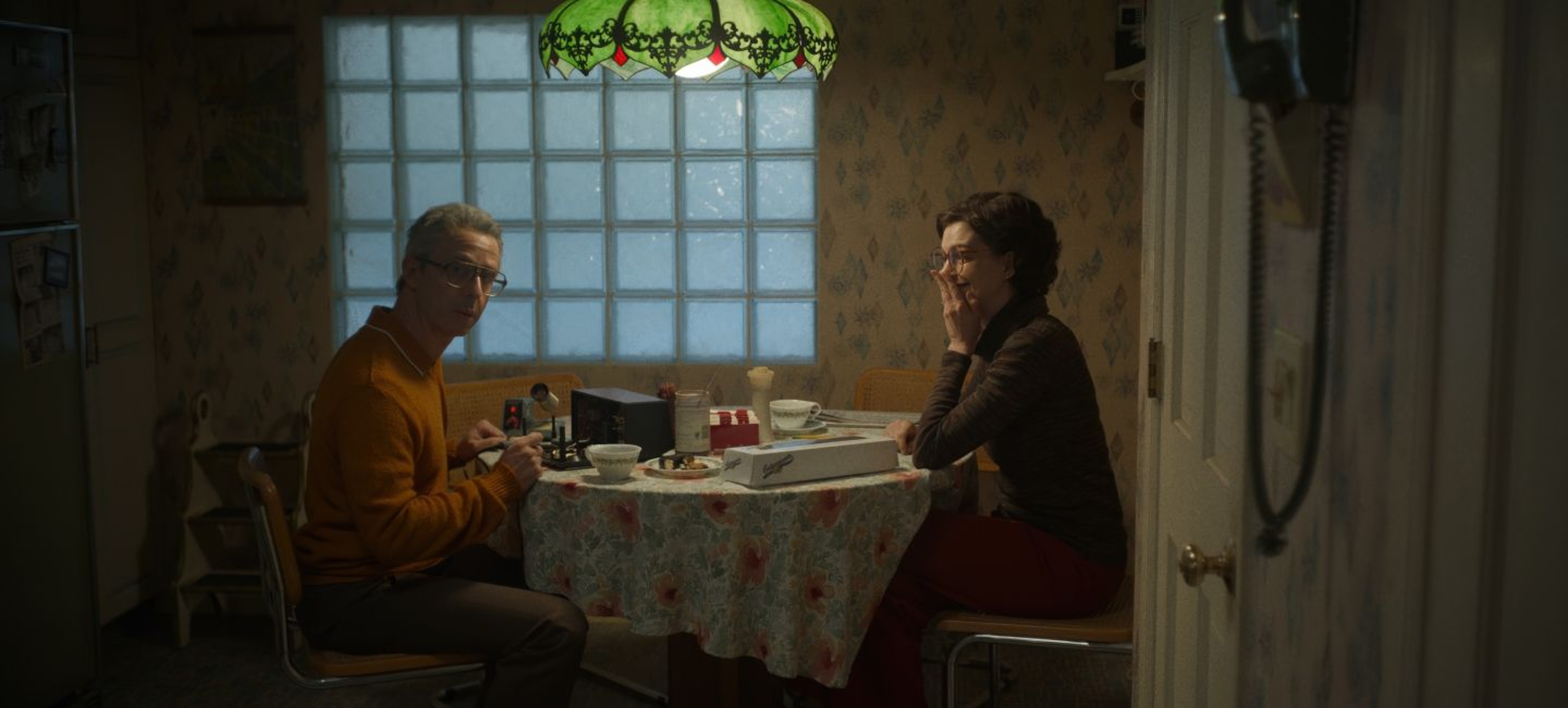
When I looked at all the photos James provided me, I noticed there was a lot of green and brown in them. And for some reason the pictures were all very dark. In fact, when we digitally transferred them, we had to brighten them up just to see the details. In creating the family's home, I wanted all the tones to be very earthy—greens, browns, and ochres. When you look at The Immigrant, it is almost the same palette. In a lot of ways, the sofa became key in determining the palette. A lot of the tones and colors were expanded from that.
Writer/director James Gray on the set of Armageddon Time
Where did you shoot the various schools in the film?
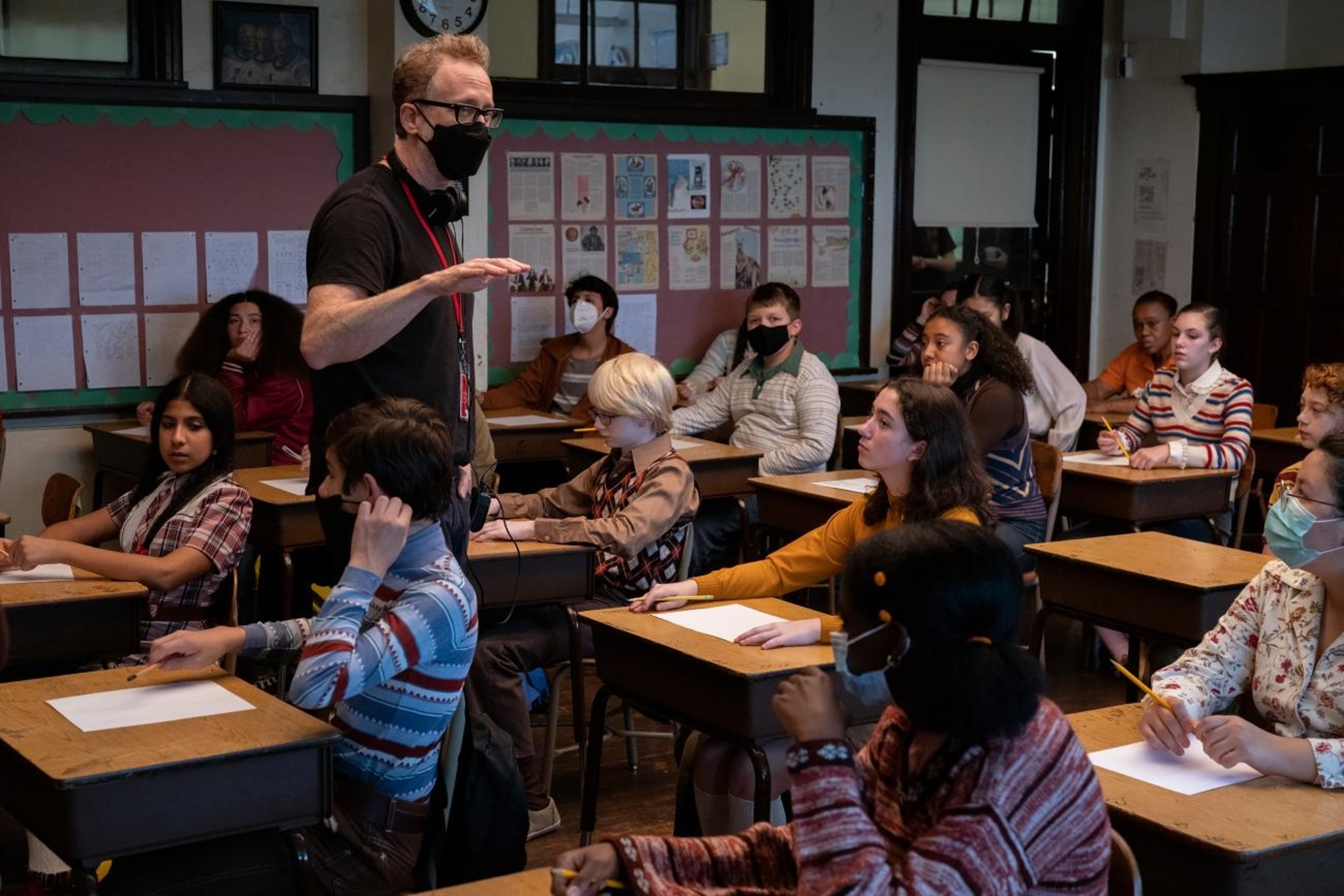
We ended shooting in Bayonne High School, which ended up being a sort of studio for us. In addition to the schools, we shot five other locations there. There are two wings in the school, which we used in different ways. For the public school, we just dressed the classroom, set up shades and window treatment. We used the hallways for the private school based on the Kew-Forest school. We were able to shoot both the public and private schools in the same wing. In the other wing, which was more modern, we created the computer room. Originally, I worried it might look too modern, but when James saw it, he said it looked exactly like the computer room in his school.
There are so many objects, from compact TVs to period lunchboxes, that give the film its authenticity. How did you gather all those period artifacts?
I think that James has a photographic memory that goes beyond his own lifetime. He remembers every little detail, such as a friend’s lunch box, perfectly. When I had a question, he could find the exact object in two minutes on Google. For the computer that was stolen in the film, we had to find an Apple II. At the time it came out, the Apple II had three components, which we found. What we didn’t know—but James did—is that it didn’t have all three components when it was launched. On the day of the shoot, I had to scramble to find the right component that it had when it came out. James was incredibly helpful in getting all the details right, like the exact dining room chandelier used in the film.
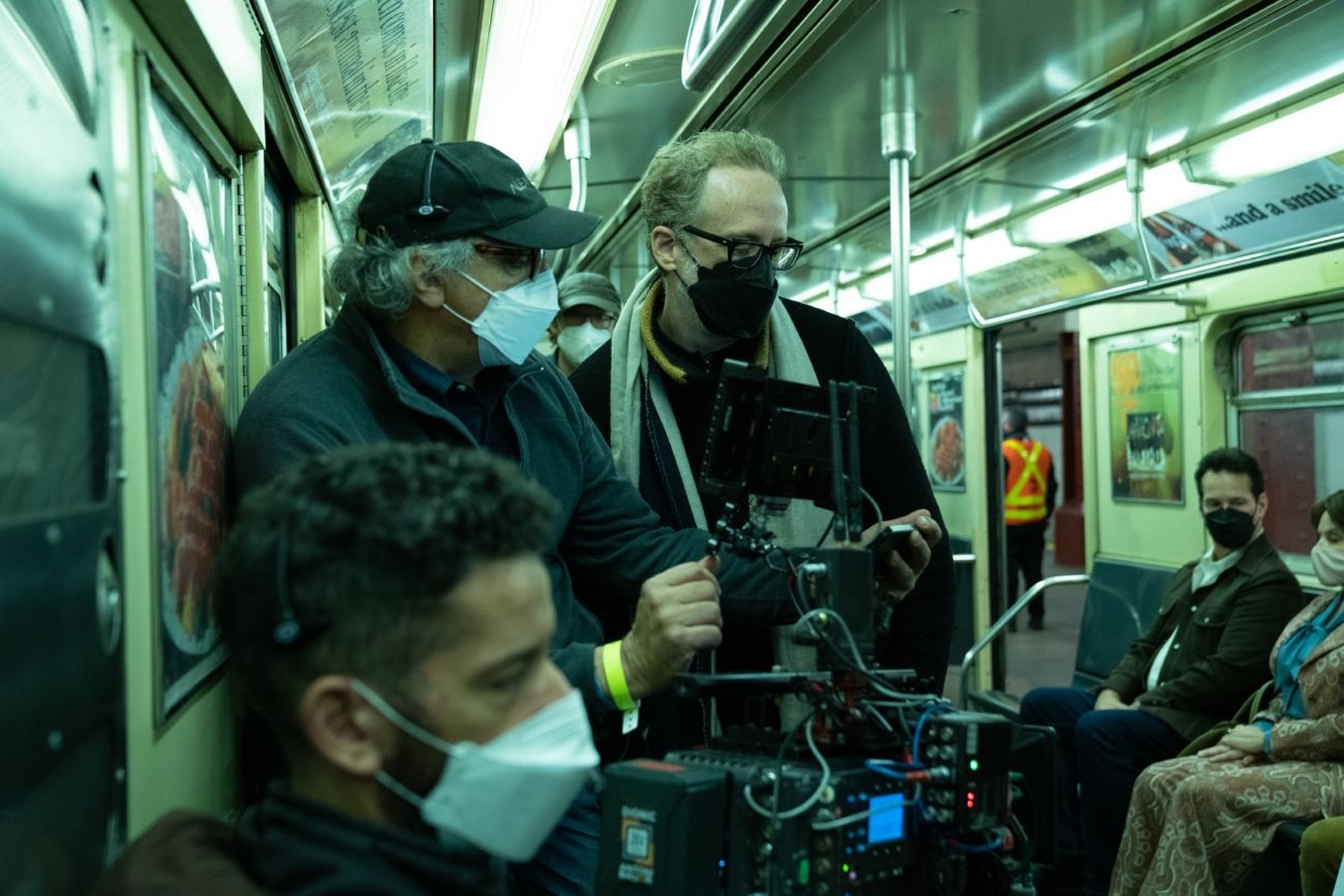
Director of photography Darius Khondji and director James Gray on the set of Armageddon Time
Were there particular aspects of the design that you are particularly proud of?
The way that everything came together on this movie was sort of magical. So there really wasn't one thing that stood out. When you look at the subway, the video arcade, or the classrooms, I think they all worked perfectly. I was, however, very happy with the house. When James finally saw it finished, he felt at home. That was very important to me. I wanted to create an environment that was not only aesthetically beautiful but was also a place that James could relate to and in which he could freely direct his actors.
What do you want people to take away from the film?
I hope it is recognized as something that is still socially and politically relevant, that people are able to see that despite all the progress we have made, we still have a lot of work to do.
