Behind the Credits: Natalie Nareau Hoffman, Graphic Designer, Never Rarely Sometimes Always
Meet the artist whose work on the bulletin boards of Eliza Hittman’s drama
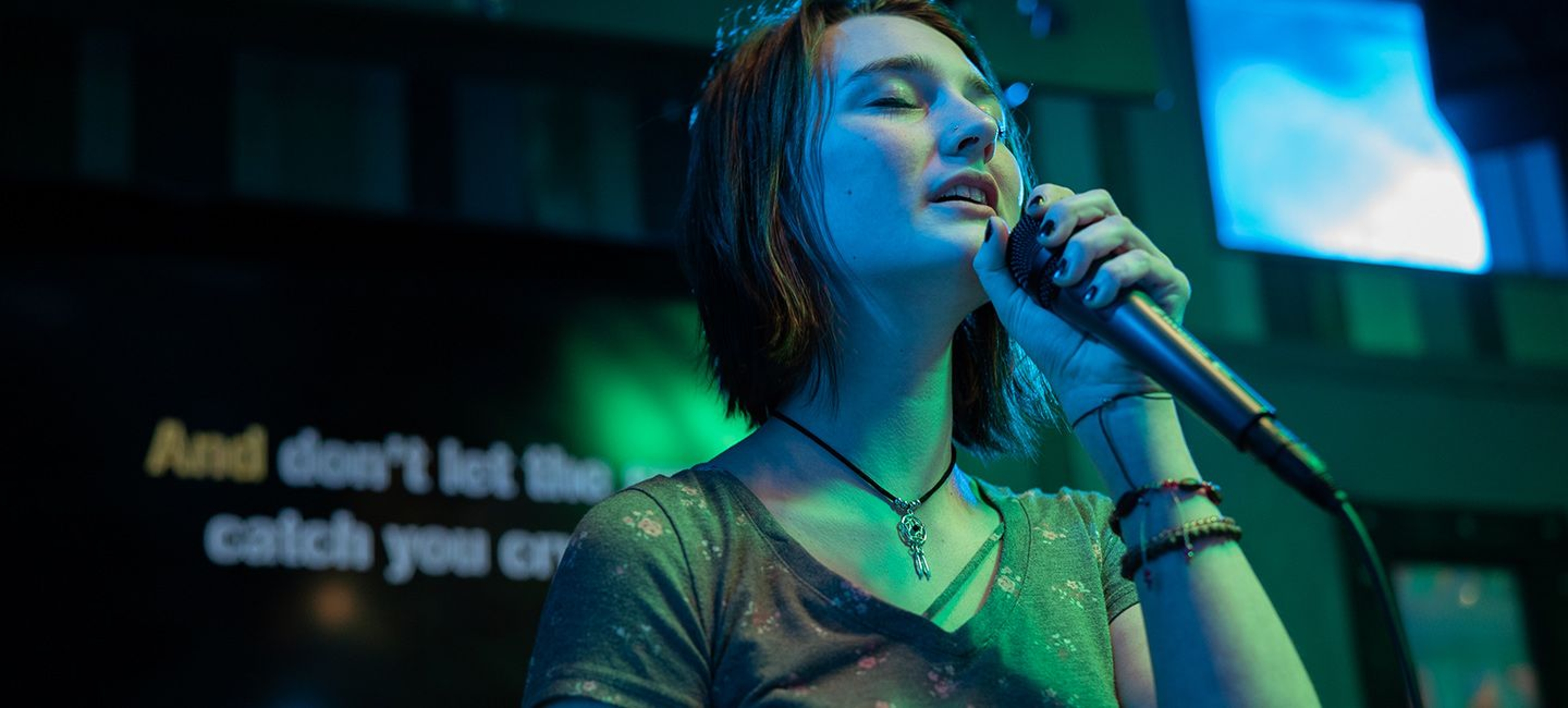
In Eliza Hittman’s Never Rarely Sometimes Always, Autumn (Sidney Flanigan) and her cousin Skylar (Talia Ryder) take a bus from rural Pennsylvania to New York City to seek out necessary medical care. Alone in this sprawling metropolis, the young women must decipher the maze of New York City and its public health care system. “Hittman captures the feeling of what it's like to be adrift in one of the world's biggest cities,” exclaims The Los Angeles Times. Never Rarely Sometimes Always' power and authenticity has been honored by being nominated for seven Spirit Awards this year, more than any other film. To create the textures of a bewildering, sometimes hostile world, the filmmakers hired graphic designers, like Natalie Nareau Hoffman, to create the signs, posters, and infographics that fill up the worlds that Autumn and Skylar live in. A visual artist who has worked in film, television, music videos, and fashion editorial, Hoffman adapts her graphic sense to serve a range of needs and stories.
As part of our series Behind the Credits, we talked to Hoffman about the work she created for Never, Rarely, Sometimes, Always, her career as a graphic designer, and what’s next in her life.
Watch Never Rarely Sometimes Always now on iTunes or Amazon.
The official trailer for Never Rarely Sometimes Always
How did you end working as a graphic designer for Never Rarely Sometimes Always?
I had worked with production designer Meredith Lippincott and art director Tommy Love as the graphic designer for a film called Bad Education [directed by Thoroughbreds writer/director Cory Finley]. They reached out to me to come on as the graphic designer for Never Rarely Sometimes Always.
What sort of graphic designs did you create for the film?
I designed and fabricated what we refer to as gak. In graphics terms, gak is an all-encompassing designation assigned to the stuff—flyers, posters, pamphlets, bulletin board clippings, the junk mail on the counter, the clutter of takeout menus on the fridge, etc.—that’s made often at the last minute once the hero graphics are out of the way. They visually cement whatever world you’re building. Gak can be instrumental in getting the look of a set right. One of the things I’ll often flag when watching a film is a certain perceptible emptiness that arises out of not having enough graphic clutter: the bare walls of an office cubicle or school hallway, the suburban kitchen absent of school calendars, piano recital reminders, carpool schedules, etc.
What specifically did you design for Never Rarely Sometimes Always?
For the crisis pregnancy center, where our main character is initially lured under the promise of a free pregnancy test, I designed more than 15 different brochures, a handful of larger posters, as well as a bundle of dated, clip-art type flyers that the women running a place like this would have made themselves. I relied heavily on research and archive findings, digging up and replicating the imagery you might come across in the actual environment: fetal milestone posters, sexual exposure charts with fine-print bible verses at the margins, mildly coercive, pro-adoption teen pregnancy pamphlets. The idea being that the totality of these graphics, hopefully, prompts the audience to ask: Is this a women’s health center, or something more sinister?
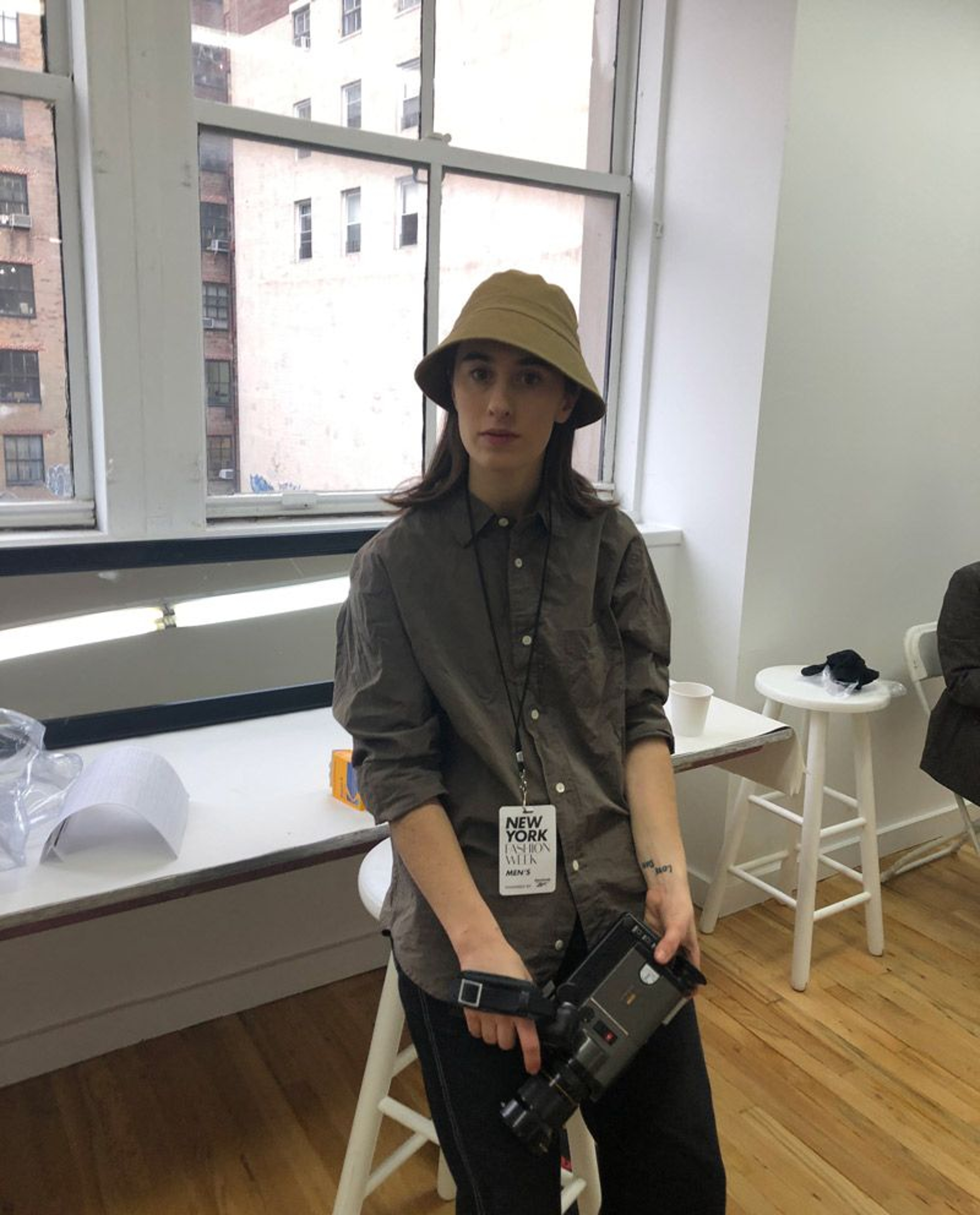
Graphic designer Natalie Nareau Hoffman
What is your process in deciding what materials you need to make?
I start with creating a thorough graphics breakdown from the script. I read through it, flagging any hero graphics specifically called out as props or set dressing, but also noting scenes that might need graphics that aren't explicitly mentioned. As the start of shooting approaches, that breakdown is amended to match the shooting schedule, locations, anything that comes up from the tech scout, and requests from props, set dec, the designer, or the art director. On large projects, the lead graphic designer often ends up doing a lot of management in addition to her design work. You’re coordinating with clearances (a script might say a character walks past a “hair salon,” but for the purposes of making the signage for that hair salon, you need an actual name, i.e. “Natalie’s Hair Salon," which needs to be cleared); props (a character is taking vitamins, for example, so you’ll need to design nondescript vitamin labels); set decoration (creating anything from signage, to patterns for custom wall coverings); and lastly, with the art coordinator and art director, to insure that all of these graphics are the right size, fabricated correctly, and delivered where they need to go on time.
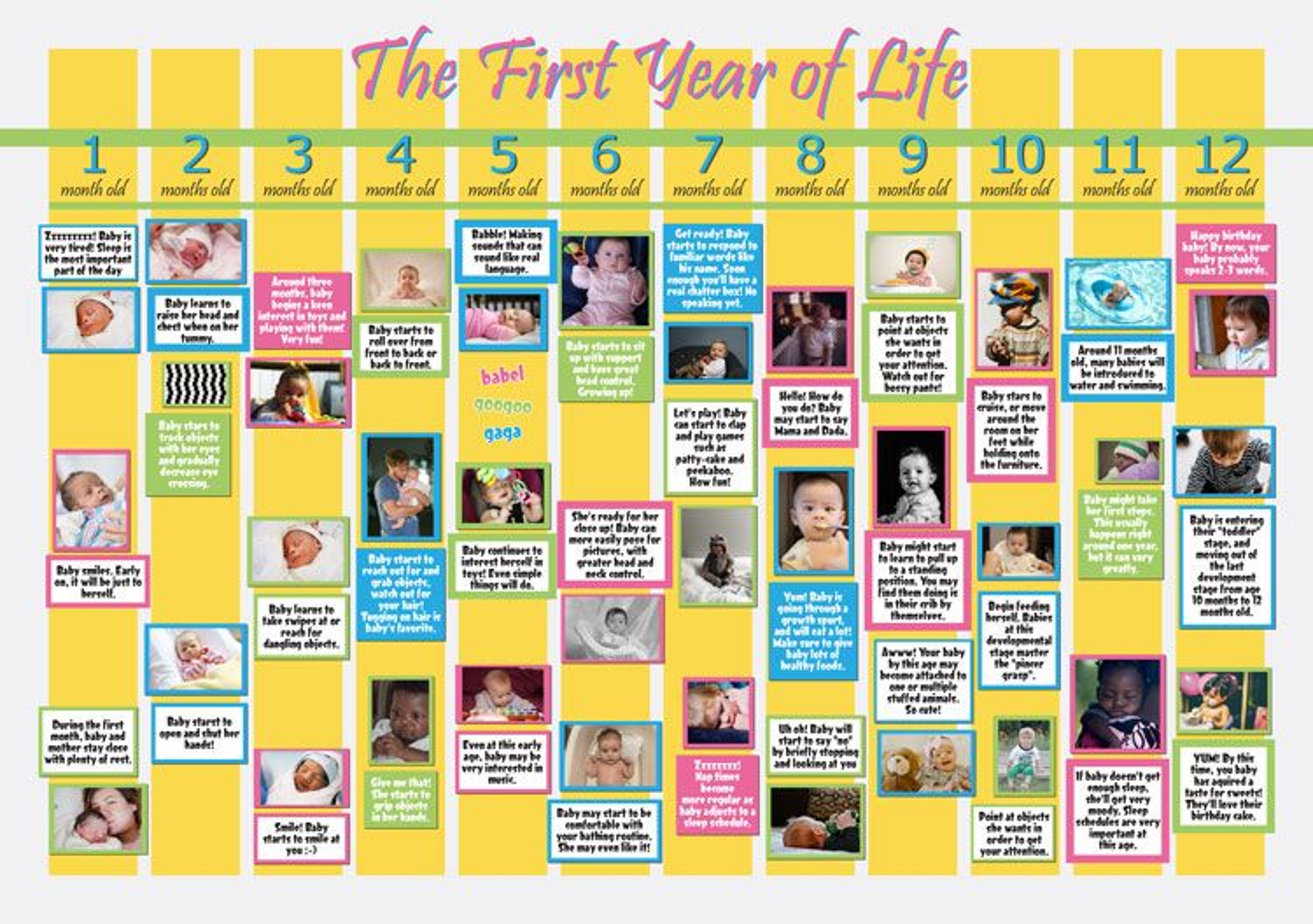
“The First Year of Life” Poster for Never Rarely Sometimes Always.
How do you feel when you see a piece of work you created in a film?
It depends! If I see anything handwritten, I instinctively shrink. I’ll avoid using my own handwriting at all costs. But seeing graphics you’ve made and are proud of on screen is always fun. Working as a graphic designer for film invites a lot of opportunities to add in tiny details, often unnoticeable in the final edit, but there nonetheless. One of my favorite parts of the job is being in charge of those details. Coming across any “insert” shots—i.e. an insert of a plane ticket, or a yearbook—however, is always particularly terrifying from a graphics standpoint. You can go over a finished graphic a million times, pixel by pixel, before it’s sent to set, and still potentially miss an error that you’ll only catch on the big screen. In one of my favorite podcasts, 99% Invisible, Annie Atkins, the graphic designer behind most of Wes Anderson’s films, recounted her experience of noticing the hero pastry boxes in Grand Budapest Hotel had a spelling error, only after they’d already shot the scene.
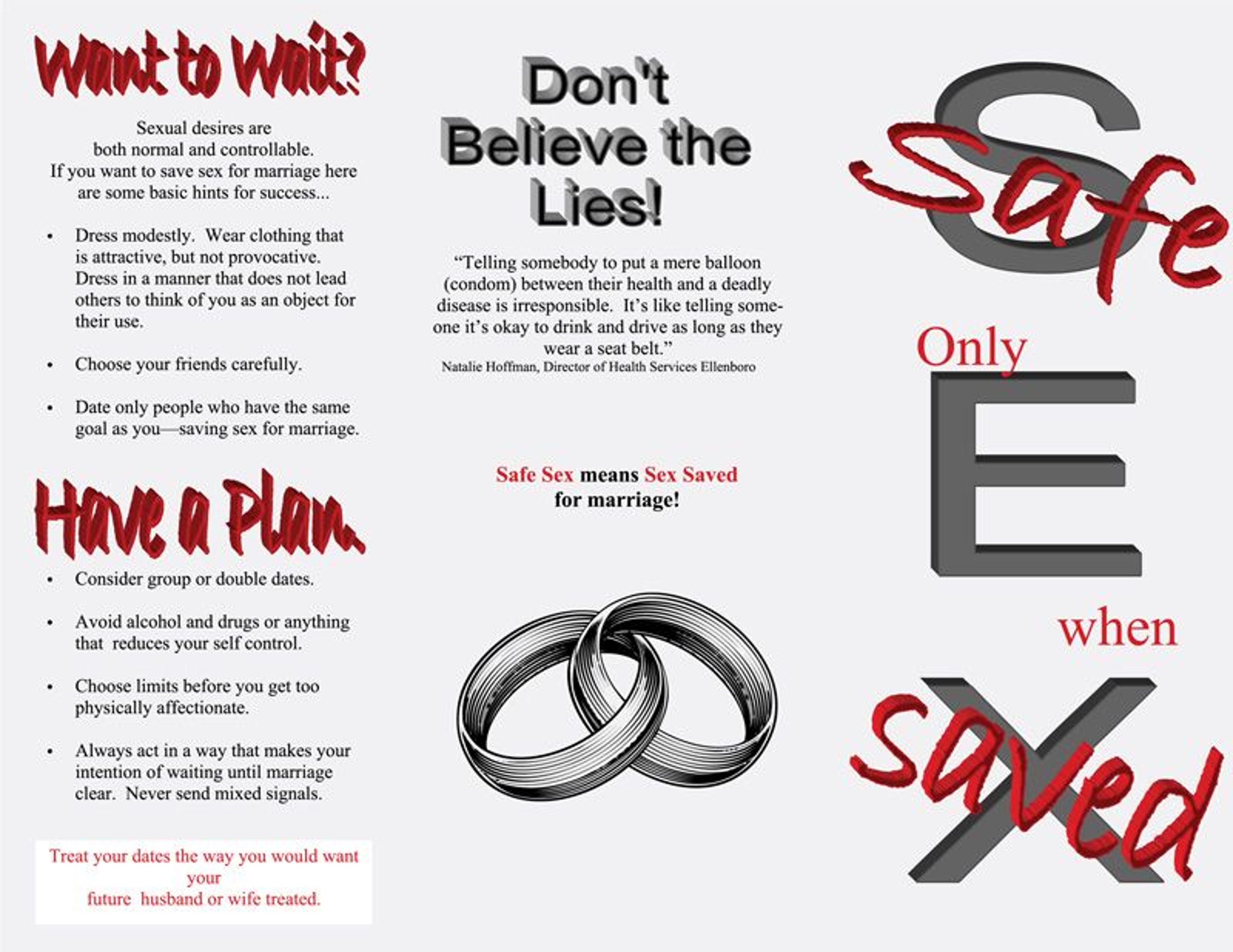
“Don’t Believe the Lies” poster created for Never Rarely Sometimes Always.
Do you watch other films for how they handle graphic design?
Like most film workers, I imagine, there are always certain behind-the-scenes details you’re privy to, and that jump out when you're watching a film—a common and relatively well-known one being the use of the area code (555) for the majority of graphics involving a telephone number (business cards, take out menus, billboard advertisements). It can be difficult to separate my watching as a spectator from my watching as a graphic designer, art director, or set designer, but I do try to focus on the story, and not the typefaces or chair model on screen. Working in film can certainly take a bit of the so-called movie magic away, of course.
Besides film, what other sorts of media do you work in?
I do a fair amount of visual art out of my studio here in Brooklyn—a combination of sculpture, collage and works on plywood and dead stock paper. I shoot a bit of 8mm as well, mostly for fun, and as BTS footage on projects I design. Most of the art pieces I do draw heavily on my tendency to collect and organize. I have a few assemblage pieces from the past year that used discarded lotto tickets and single playing cards that I would pick up off of the street. I had about 550 individual lotto tickets, and 400 playing cards before I began adhering them to plywood and framing them. While stuck at home during the Covid-19 shutdown, I began work on a piece that involved painstakingly cutting out every single ’N’ and ‘O’ from a collection of maybe 250 1970s Mad Magazines that I amassed. Recently, I began doing these larger scale works using hundreds of cut wood cubes, paint, and glue on plywood.
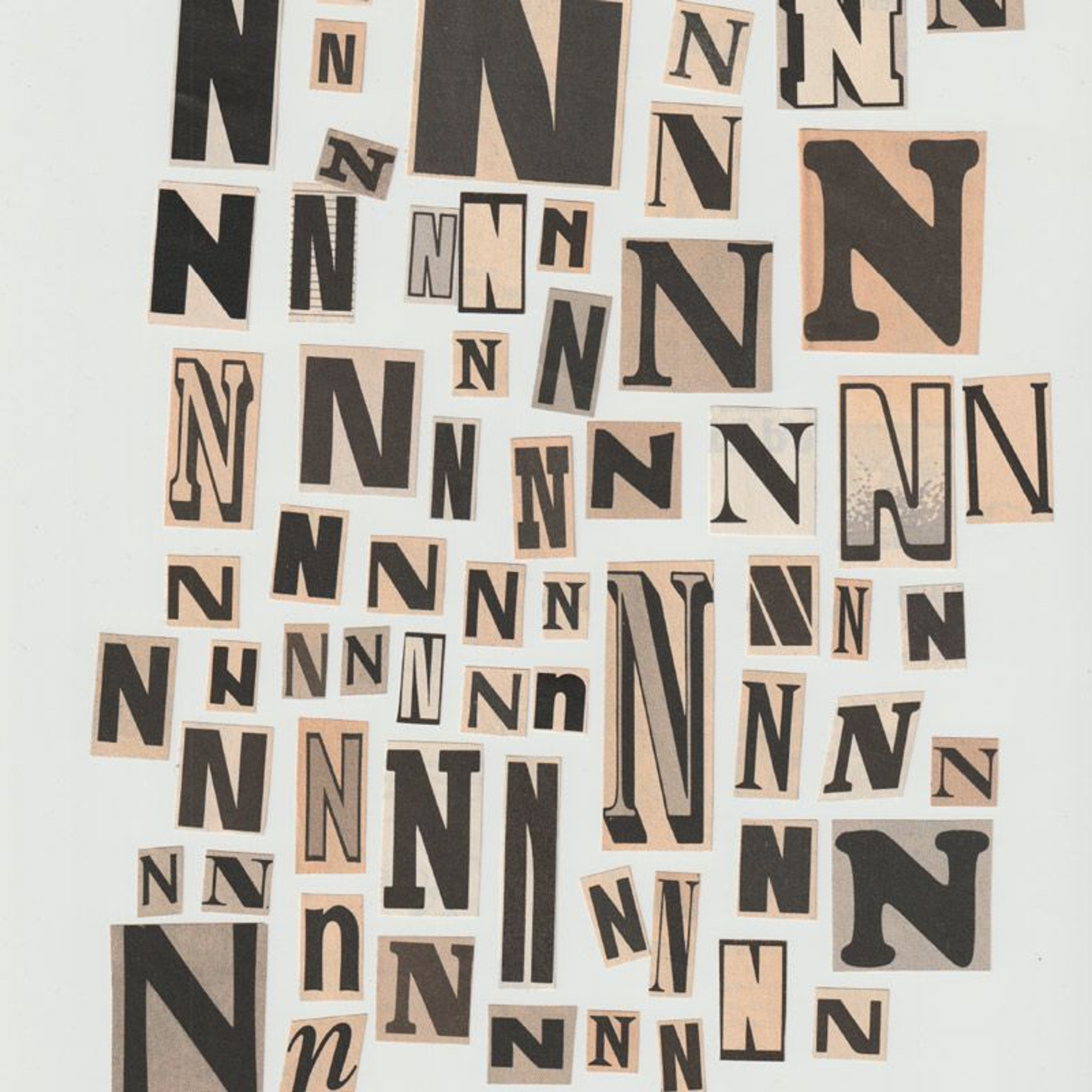
One of Hoffman's Mad Magazine "N" series.
When you were a child, what did you want to do?
I always joke that the root of my interest in set design comes by virtue of a lifelong meddlesome fascination with the private lives and spaces of other people. I frame it as curiosity now, but truth be told I was incredibly nosy as a kid. Growing up, I had a questionable pastime of digging through the locked drawers, hidden-away shoe boxes, and personal belongings of my parents and siblings in an admittedly obtrusive and nonconsensual pursuit to unscramble them (that I’ve since repented for). I’ve always been preoccupied with the objects people choose to hold on to, and why. Throughout primary school, my twin brother Nick and I would spend our weekends replicating our favorite films, à la Be Kind Rewind, on my parent’s VHS-C Sony Handycam. As a kid I wanted to be a storyteller of one sort or another. The first film I distinctly remember Nick and I replicated, and I say this with no shame whatsoever, was Spy Kids. We called our version Double Trouble.
What was the first film you saw that made you want to work on films?
The majority of my inspiration for filmmaking comes more from real life, rather than the films I've watched. My Mom always kept a video camera on the kitchen counter, and she’d pick it up whenever she had a free hand to interview me and my siblings, or ask us to act out a story of some kind. Since high school, I’ve done the same (to the ire of my friends and family). I’m constantly taking reference photos of odd and amusing signs I see on the street, characters out and about, visually compelling locations, etc. Those are the things that get me excited about working in film, and those are the resources I draw on when working as a graphic and set designer. I don’t place a huge importance on having an encyclopedic knowledge of film history. I love cinema, but I’m by no means a film buff. I think the experiences a person has as a human being first are what ultimately make them a good film worker.
What sort of work would you ultimately like to do?
I actually got my start as an intern and script reader at Filmnation Entertainment, my senior year of university, reading and providing coverage on scripts. I think I cold emailed them for the job. When I graduated, the company was just starting work on The Big Sick. I was brought on initially as an art department intern, then ended up doing the graphics. The majority of my professional work at this point in my career, though, is as a set designer in the editorial, music video, and commercial worlds. Graphics make up about 25% of my work, I’d say. Editorial set design and standalone visual art is definitely my professional focus, but I’d also like to explore working in children’s arts education, potentially in a volunteer capacity. I’d love to run a children’s museum.
If you made a movie, what would it be about?
I’d love to! Hopefully eventually. I wrote a feature a while back called United States vs. One Lucite Ball Containing Lunar Material (Moon Rocks), based on the maniacal court case of the same name (theft of the Honduras lunar sample displays). I had two shorts I put in the drawer some time ago: one called A Sobering Trip Through the Federal Bureaucracy, and the other called Jog-A-Thon/No Country for Peanut Farmers. I have a certain penchant for novelty.
Sign up for the all-new Focus Insider program to unlock access to exclusive rewards, sweepstakes, once-in-a-lifetime movie experiences, and so much more!
