In Drive-Away Dolls—directed by Ethan Coen and written by Coen and Tricia Cooke—Jamie (Margaret Qualley) and Marian (Geraldine Viswanathan) take an impromptu road trip from Philadelphia to Tallahassee, during which they meet new friends, discover a surprise package in their car, and escape from a pair of bumbling criminals. With a cast that includes Matt Damon, Pedro Pascal, Beanie Feldstein, and Colman Domingo, the film provides a wild ride for everyone involved.
To help set the film’s antic tone, the filmmakers brought on production designer Yong Ok Lee, whose previous work on Minari had impressed them. “She got the tone and humor of the movie in a way that we thought would work well for us,” Cooke says in the production notes. Shooting the film in Pittsburgh, Lee used local spots and soundstages to recreate a trip to Florida by using color schemes, creative designs, and a lot of imagination.
We talk with Lee about creating the various locations, using colors to map out the road trip, and infusing the various bars with a noir ambiance.
Get tickets now for Drive-Away Dolls, in theaters this Friday!
The official trailer for Drive-Away Dolls
When you read the script, what were your thoughts about how to approach the production design?
To be honest, I wasn't sure how I was going to approach the design process, because I've never done a comedy or a road movie before. So, I thought about how I could make it interesting and weird. I started by doing a color breakdown to explore how I would use color throughout the movie. I didn’t want to focus too much on the details. Rather, I thought about how to make it bold and maybe a little over the top.
Since this is a road movie, how did you identify the different areas?
Their trip goes from Philadelphia to Tallahassee. So, I first researched what is the character for each of the locations. What characterizes Philadelphia? What does Georgia have? I especially thought about weather and geographic changes and what the greenery would be. Luckily, many of the locations are motels and bars, so we didn’t have to worry that much about the landscape, except for the Florida sections. Florida has different greenery, so for those sets, we focused on palm trees and flowers. For me, it was fortunate that so many highway motels are so similar.

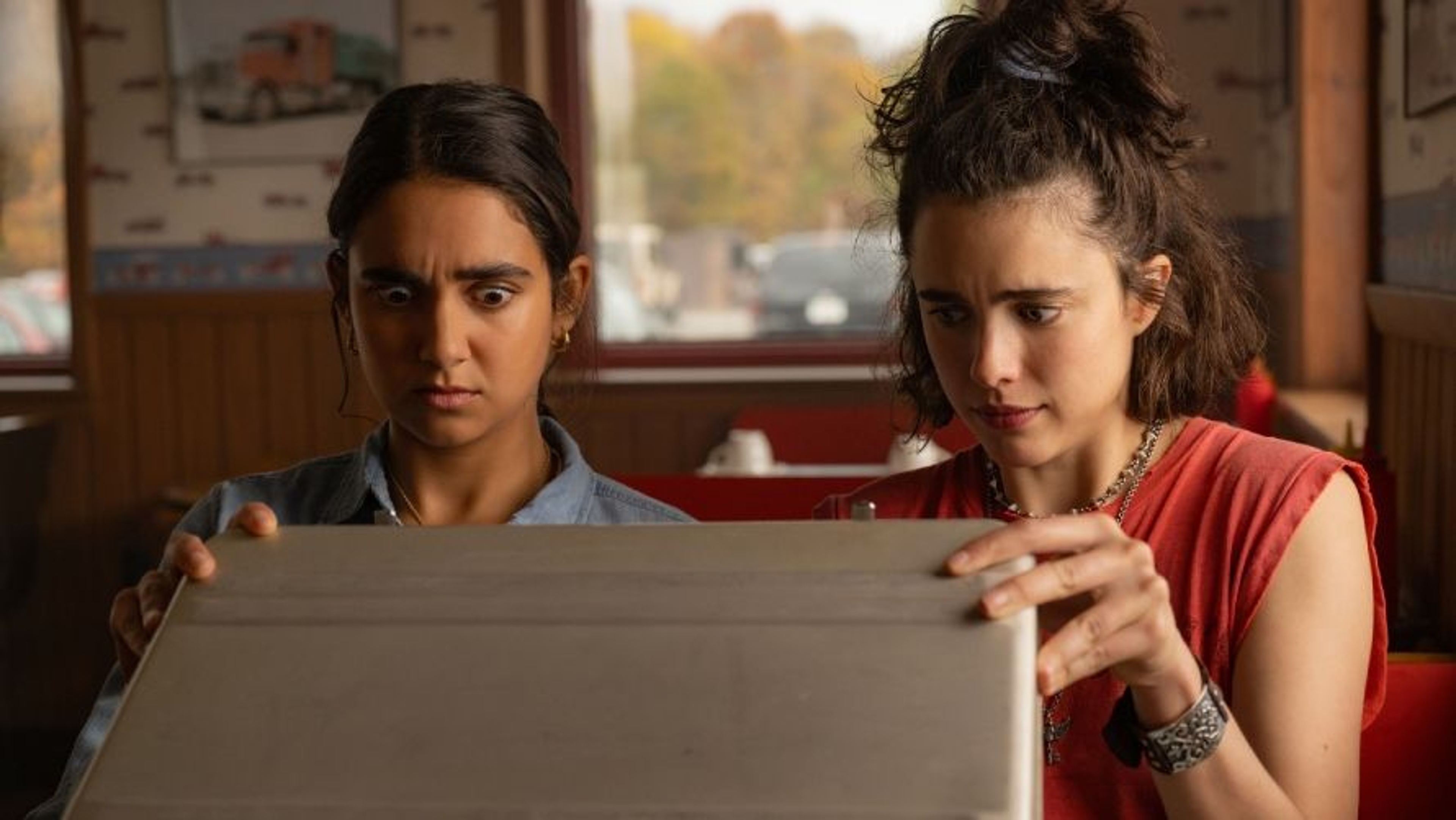
Geraldine Viswanathan and Margaret Qualley in Drive-Away Dolls
Did you shift your palette as they traveled from north to south?
Mostly I worked with red and blue, but I changed the saturation as they drove south. In Philadelphia, we used darker tones. It was almost a burgundy for the reds and a navy for the blues. When we go south, the blues go more towards purple.
A lot of scenes take place in different bars. How did you set the tone for those?
We created signage for all of the bars that suggest the place. There is a sign for Cicero’s Bar, which is a sort of Italian speakeasy, and Sugar ‘n’ Spice, which is a lesbian bar in Philadelphia where the signage suggests a sexier, attractive crowd, and the She Shed in Tallahassee. For the Butter Churn, we created a more rural dive, a place that seemed like it was the only lesbian bar in the area. We did a lot of that with the graphics in the film.

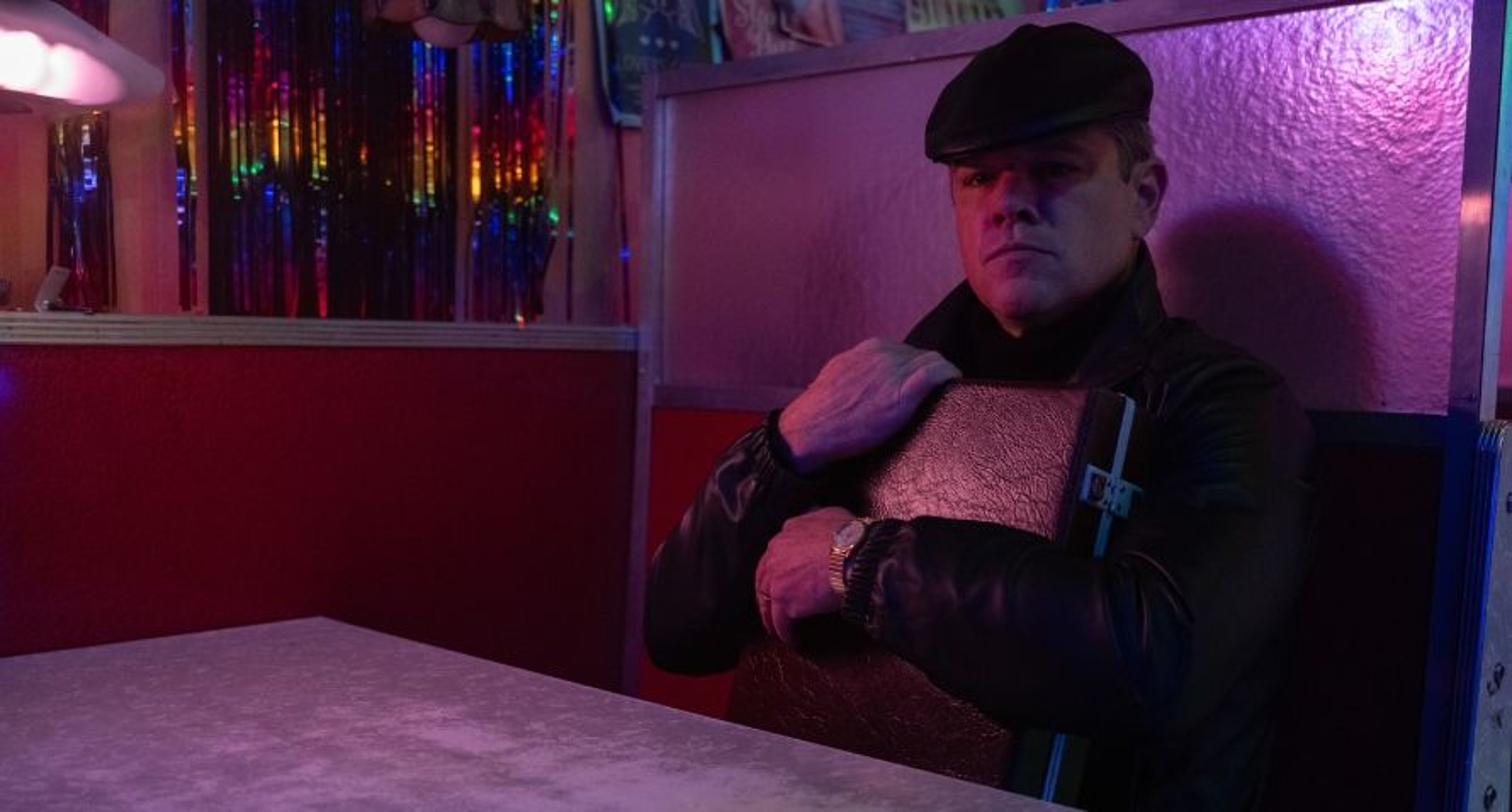
Matt Damon in Drive-Away Dolls
Many of the spaces are quite dark. How did the production design accommodate that?
I would discuss with the gaffer how they were planning to light the scene. In many of these places, we chose material that was shiny or reflective to pick up on the light. In others, we wanted it to be darker, more like a noir movie, and we would just have soft light from above.
Was there a set that turned out particularly well?
I think the She Shed came out really well. We had to change the entire exterior to make the space feel like it was in Florida. We built a whole new facade on an existing storefront.
What would you like people to take away from the film?
I just want people to come and enjoy the comedy.
This interview has been edited and condensed for clarity.
.jpg?branch=production&width=3840)