The Fabric of Everyday Life: Creating the World Of Dark Waters
A Q&A with production designer Hannah Beachler
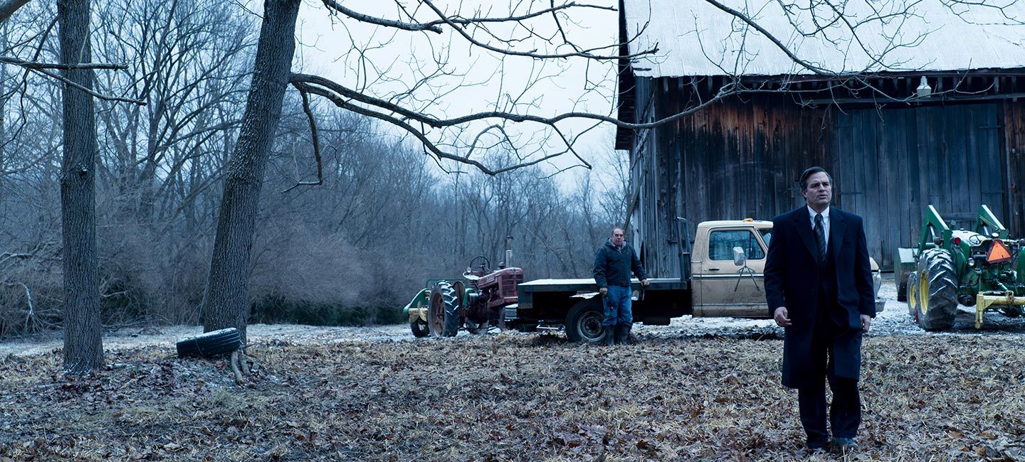
In Todd Haynes’ thriller Dark Waters, corporate defense attorney Rob Bilott (Mark Ruffalo) has his world turned upside down when two West Virginia farmers approach him with what seems like an incredible proposition. Wilbur Tennant (Bill Camp) claims his land is being poisoned by the industrial behemoth DuPont, the very kind of firm Bilott had become a partner defending. Unable to shake off their story, Bilott begins an investigation that would take over 15 years and would uncover an unbelievable conspiracy of corporate cover ups and malfeasance that put the lives of hundreds, if not thousands, of unsuspecting people in the town of Parkersburg, West Virginia, at risk. Bilott’s quest for justice also put his professional and personal life in jeopardy, wearing thin the endless patience of his wife Sarah (Anne Hathaway). In the end, his relentless fight to find the secret DuPont tried to bury not only saved a community in peril but opened up the world's eyes to the widespread existence of toxic chemicals in our lives. To bring out the lived textures of the many worlds and times in which the story unfolds, Haynes turned to production designer Hannah Beachler. Having grown up in Ohio and attended college in Cincinnati, Beachler had an intimate knowledge of the film’s real-world locales. As a production designer for such intimate dramas as Moonlight and Fruitvale Station, Beachler is particularly sensitive to capturing the material fabric of everyday life. At the same time, her imagination can bring to life whole new worlds, as demonstrated by her Academy Award®-winning work on Black Panther.
We spoke with Beachler about Todd Haynes’ unique cinematic vision, detailing the subtle changes of time in the characters’ world, and how she used design to bring out the suspense elements of this real-life thriller.
The official trailer for Dark Waters
What did you see as your biggest creative challenge?
I think it was capturing the span of time. As the story goes on, the culture as we see it changes. And while the characters go through various ups and downs, we wanted to keep the thematic design language consistent throughout the entire film. The seasons were another challenge. While the story covers 17 years, we didn't want it all to be taking place in just one season.
Todd Haynes is such an innovative filmmaker. How was it working with him?
In addition to being a creative director, Todd is a master of craft. You always want to be in a situation where you are learning in your career, and I learned so much working with Todd. I knew Todd's work from such films as Velvet Goldmine, Far from Heaven, and Carol, which were all quite stylized. When we started production, I was curious to see how he might fold that aesthetic into the screenplay’s docu-narrative. This is a real story based on real people who are still alive. It was fascinating to see how he added more color or accent to shape the story. The other thing that is important here is that Todd is very aware of the relevance of this story and why it is so important to tell.
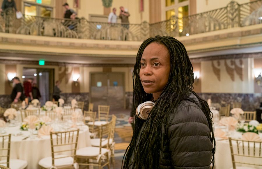
Production designer Hannah Beachler on the set of Dark Waters
How did growing up in the part of the country the story takes place help you in the production design?
I went to the University of Cincinnati back in 1989, when Rob Bilott was just getting involved in the case. So I was familiar with the city and with the Taft law firm where he worked. Also I grew up in Centerville, Ohio, which is very close to Dayton. It’s a small rural area with lots of farmland that was very much like Parkersburg. I feel that I have a better understanding of that part of the world than if I had never lived there. I knew, for example, how important property is to people there. It's not about having a giant house but about how many acres you have. You don't just go on people's property. You have to have permission. It was nuanced things like that which made it easier for me to relate to the story. I had a keen sense of what Tennants' house might look like, what might be important to his wife, what her kitchen might look like, where the pantry might be.
How much was shot on actual locations and how much was created for the film?
Even though we shot in Cincinnati and Parkersburg, we still needed to create the practical locations since much of what is in the story doesn’t exist there anymore. For the Taft law firm, we shot on site, but also built a lot on sound stages, like the storage room filled with boxes of documents. For the actual Taft offices, we had to go back and change the paint and décor to make it look like it did in the late 90s and early 2000s. For the Tennants’ home, we found a farm in Ohio that looked very similar, although probably not as big. We had to rebuild the barn because it was falling on top of itself, and then paint it to make it look like it had been there for over 80 years. For the EPA building, I was really struck with the way each of the windows had these big golden curtains, so it looked like a large ballroom. So to create the EPA, we found a ballroom with wood paneling and then added the pieces— the big torchiere lamps on either side, the fireplace, the chandeliers, the curtains, and window treatment. We really wanted it to feel like the same place it was when the movie took place.
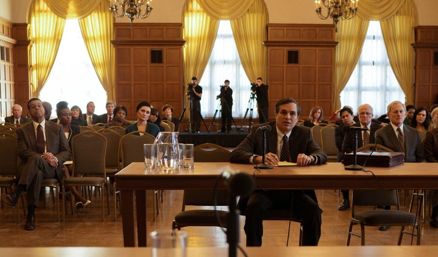
Beachler recreated the feel of the EPA in a large ballroom in Dark Waters
The movie is very much a thriller in tone. How did you use the production design to ratchet up the suspense?
One of the really fun parts of production was watching Todd work through the story. You can see him add a lot of references to other conspiracy thrillers, like The Parallax View. For the DuPont conference room, for example, we made it all very dark. I told Todd that I wanted to paint it the darkest color I could, so the color falls off and everything feels very heavy. We used a thick wood table and dark chairs to increase this feeling of DuPont being an omnipotent and powerful company. We designed the Taft offices very differently. The conference room suggested the idea of limited transparency. We put frost on the glass, so you could see people go by, but you couldn't see who they were or what they were doing. This is very much what Rob is going though, seeing only part of the story.
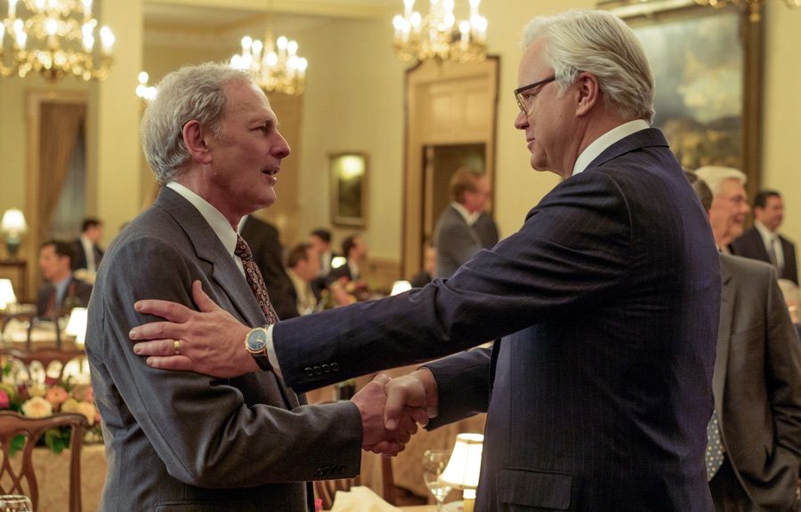
Victor Garber and Tim Robbins are corporate lawyers in Dark Waters
Did the production design suggest something toxic in the environment?
Early on in discussions with Todd and Ed [Lachman], we came up with this lighting treatment that produced a yellowy, sick feeling in some places or suggested the air was filled with little particles. Ed and I worked a lot in enhancing that with the color palette. We wanted to suggest that everything was being tainted. There comes a point where Rob starts tearing up rugs in his house because he realizes that the toxic PFOA material is in everything. It's in the curtains. It's in the rugs. It's in the couch. Everywhere.
In crafting the production design, did you look to earlier films or photography to help set the mood?
We looked at a lot of thrillers, like The Parallax View or Silkwood, especially in the way the camera treatment made things feel a lot grittier and more dangerous. As for photography, I love how Gregory Crewdson's use of color turns suburban life on its head. We also used a lot of real-life references, like photos of the EPA or DuPont's Washington Works facility. We went to the DuPont plant, but we couldn’t get any further than the parking lot. We also visited the actual homes of the families—the Bilotts, the Kigers, and the Tennants—to see how they lived.
How did you subtract or add items to show the changing of time?
People don't just get rid of everything at once. They hold onto things with sentimental value. So I didn't want there to be big dramatic changes. We just wanted to suggest how the homes reflected the cultural changes happening slowly around them. When you first see the Bilotts’ house, all their appliances are black. At the end, they are stainless steel. Their counters are not granite, and then they go to granite. Their wallpaper slowly comes down. The window treatments change from curtains to blinds. The walls' colors reflect what was popular at the time. The Martha Stewart colors of the late 90s change to darker tones, like hunter greens and merlots. While things like pillows and light fixtures changed, other things, like the couch, stayed the same. I think the Bilotts still have the same couch they had in 1989.
What would you like audiences to take away?
For me, it is the understanding that no matter how much or how little money you have, we all want a roof over our heads and our kids to be healthy. We want safe water to drink and clean air to breathe. These things are not options. They are rights.
Sign up for the Focus Insider newsletter to be first in line for free advance screenings, world premiere travel packages, weekend set visits, and so much more!